Challenge
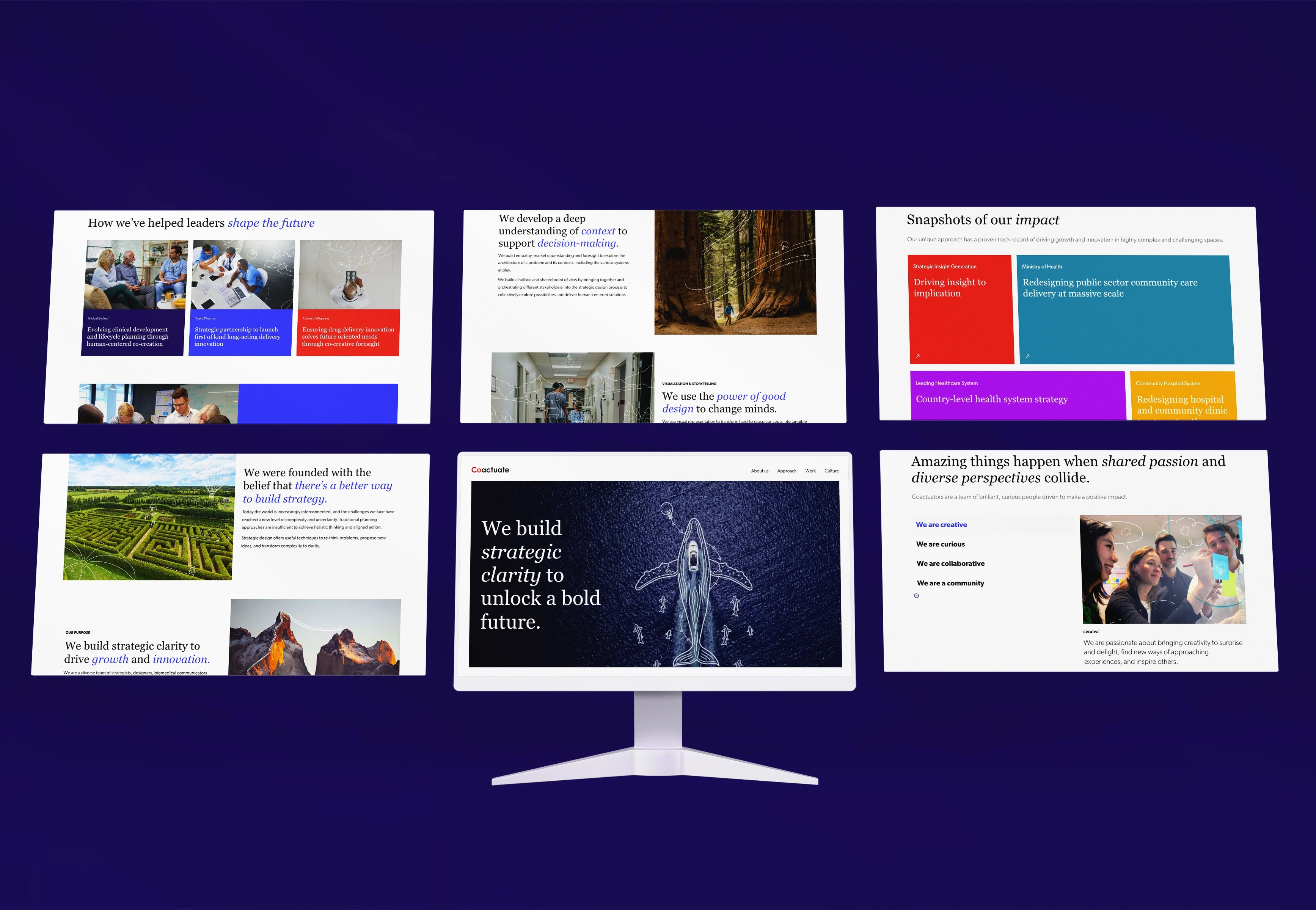
Redesign the corporate brand identity and website of Coactuate to align with their updated narrative and values.
Brand Positioning
Coactuate is a strategic design consultancy in the global pharma space that tackles ambiguous and complex challenges by integrating strategic and design-thinking methodologies.
Brand Tone
Authoritative – Confident, knowledgeable, and able to guide clients through turbulent situations
Creative – Imaginative, optimistic, and curious to see things from unique perspectives
Authentic – Honest, open, and eager to collaborate with others
Rebranding | Art Direction | Brand Strategy | Illustration | Photography | Web Design
Creative Direction: Kyle Schruder, Wynn Yau
Illustration: Wynn Yau
Icon Design: Danielle Belliveau
Web Design: Context Creative, Wynn Yau, Richmond Sedcole
Animation: Danielle Belliveau
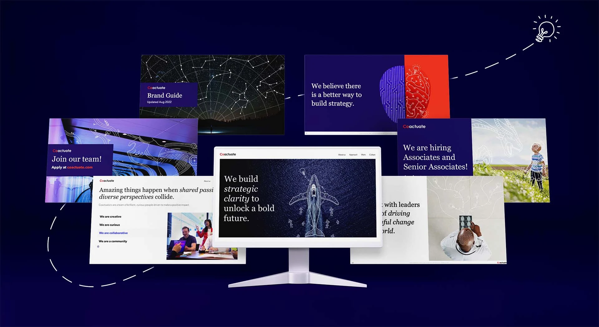
We build strategic clarity to unlock a bold future
In 2020, the Coactuate team discovered a lack of consistency in how they talked about the company and how the brand was presented across channels (e.g. website, presentation decks, recruiting materials, etc.). Leadership began to explore how they wanted to move forward as a company and build new client relationships. This kickstarted the process of comprehensive audits, competitive analysis, and multiple co-creative workshops to redefine and articulate the brand narrative before diving into countless visual explorations.
The narrative settled around these three principles:
- Clarity of Purpose – To build a shared vision of the future
- Clarity of Direction – To set a clear path forward
- Clarity of Action – To achieve the desired outcomes
The creative ruler
The combination of strategic and design-thinking methodologies were visualized as a brand personality called the creative ruler — a flexible approach that leans into both analytical and creative sides.

Colour palette
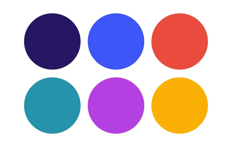
The Coactuate colour palette includes primary dark purple, paired with accents of blue, red, teal, violet, and amber. A diverse colour palette allows for flexible usage when building presentations.
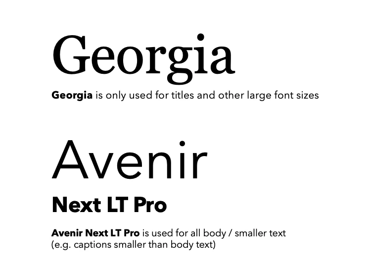
Georgia and Avenir
The decision to contrast a serif with a sans-serif font captures the balance between authoritative and creative. Practically speaking, using two system fonts enables ease of collaboration with clients and teams as files are shared back and forth.
1+1=3
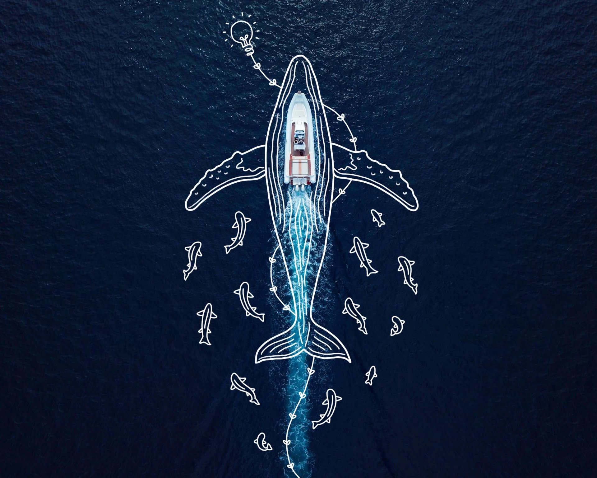
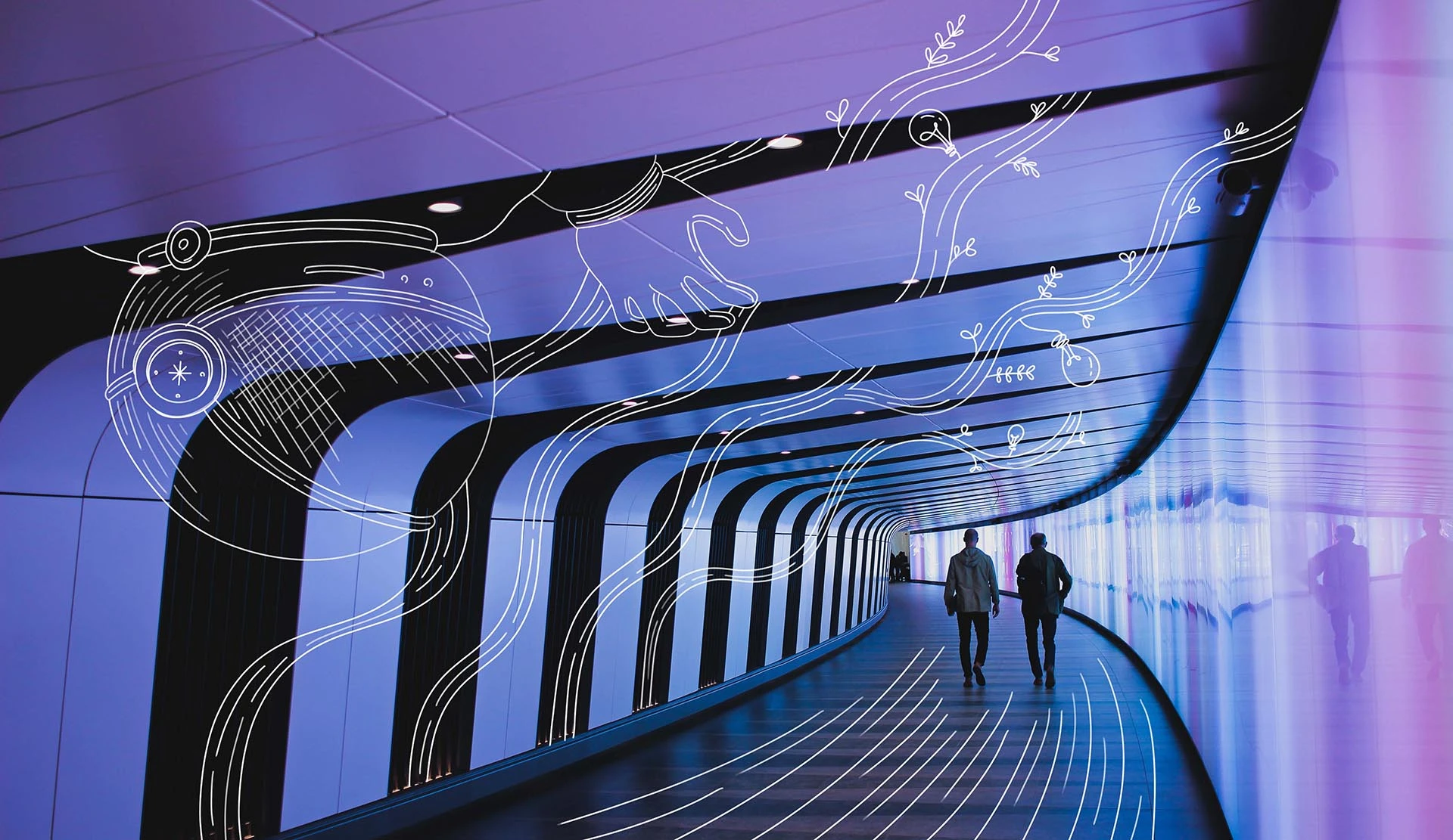
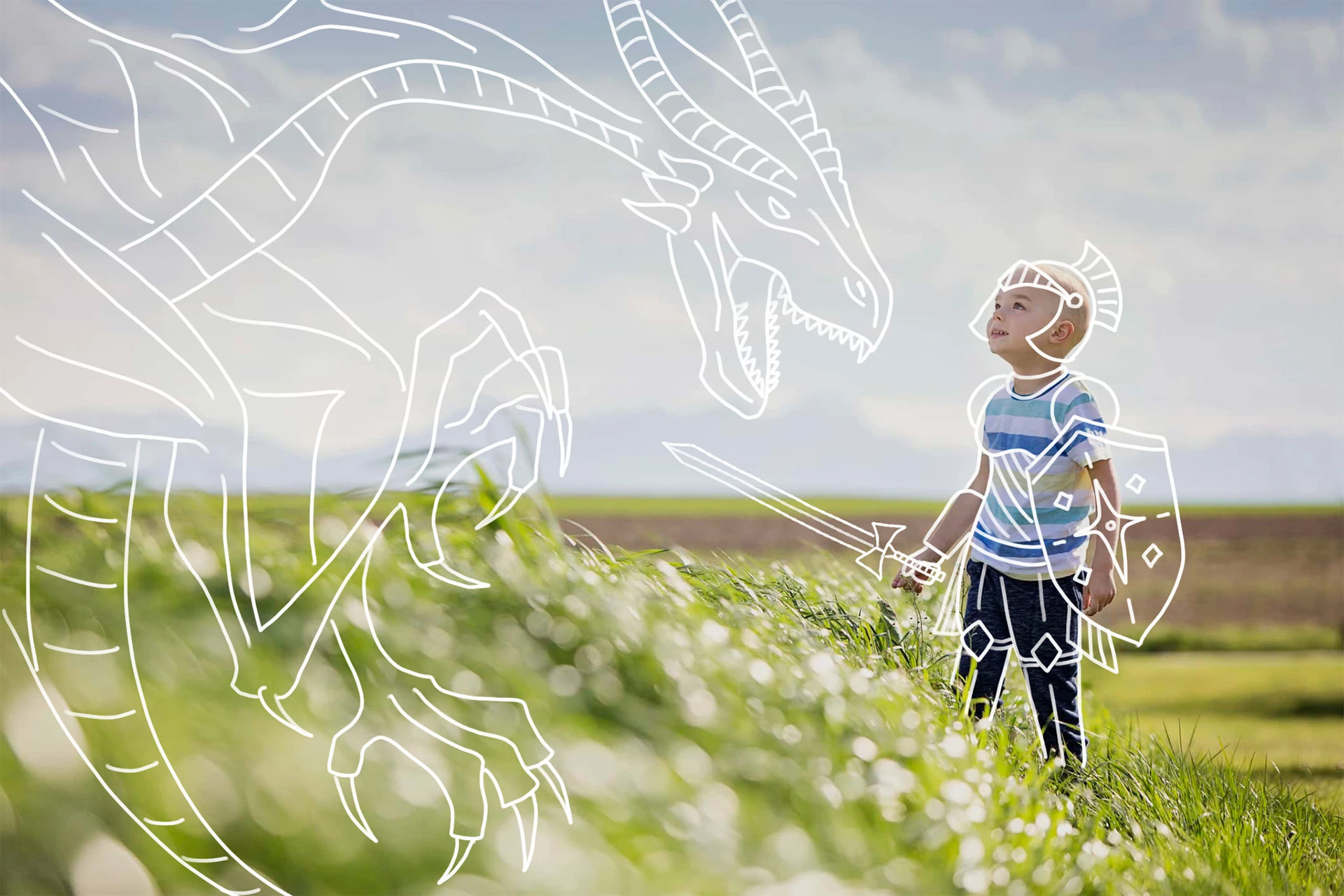
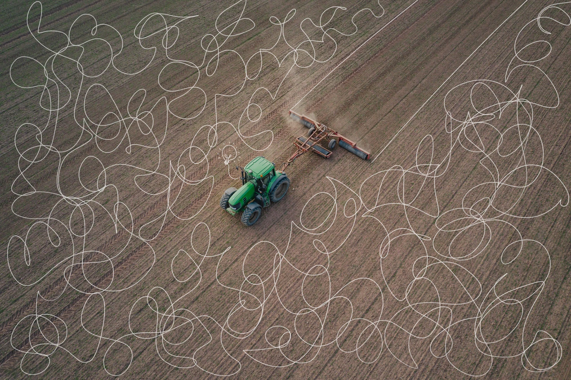
The Coactuate brand is anchored on the concept of combining two elements that become more than the sum of their parts – two visuals that are easy to understand on their own but become more interesting when put together. In key illustrations, a lightbulb can be found to add a fun element of delight.
www.coactuate.com
In collaboration with an external web agency, the Coactuate website was redesigned to reflect the updated brand identity and narrative. After months of competitive analysis, and content and media development with the leadership team, the website was finally launched in August 2023.


