Challenge
Create a brand for an ecommerce accessory brand that brings together eastern and western aesthetics for the modern working woman
Brand Positioning
ZiHeen positions itself as a brand of modern and quirky handbags that appeals to working class women without being too luxurious or edgy
Brand Tone
East Meets West, Sophisticated, Playful
Brand Identity Design
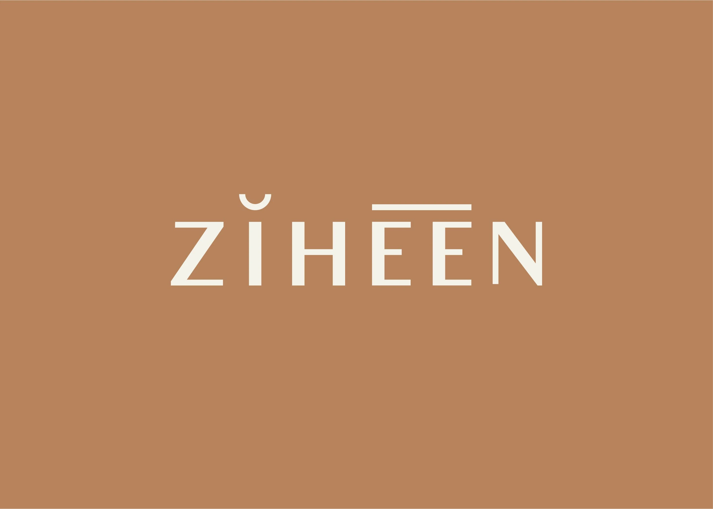
ZiHeen (芷騫) means "down to earth" and "galloping like a horse."
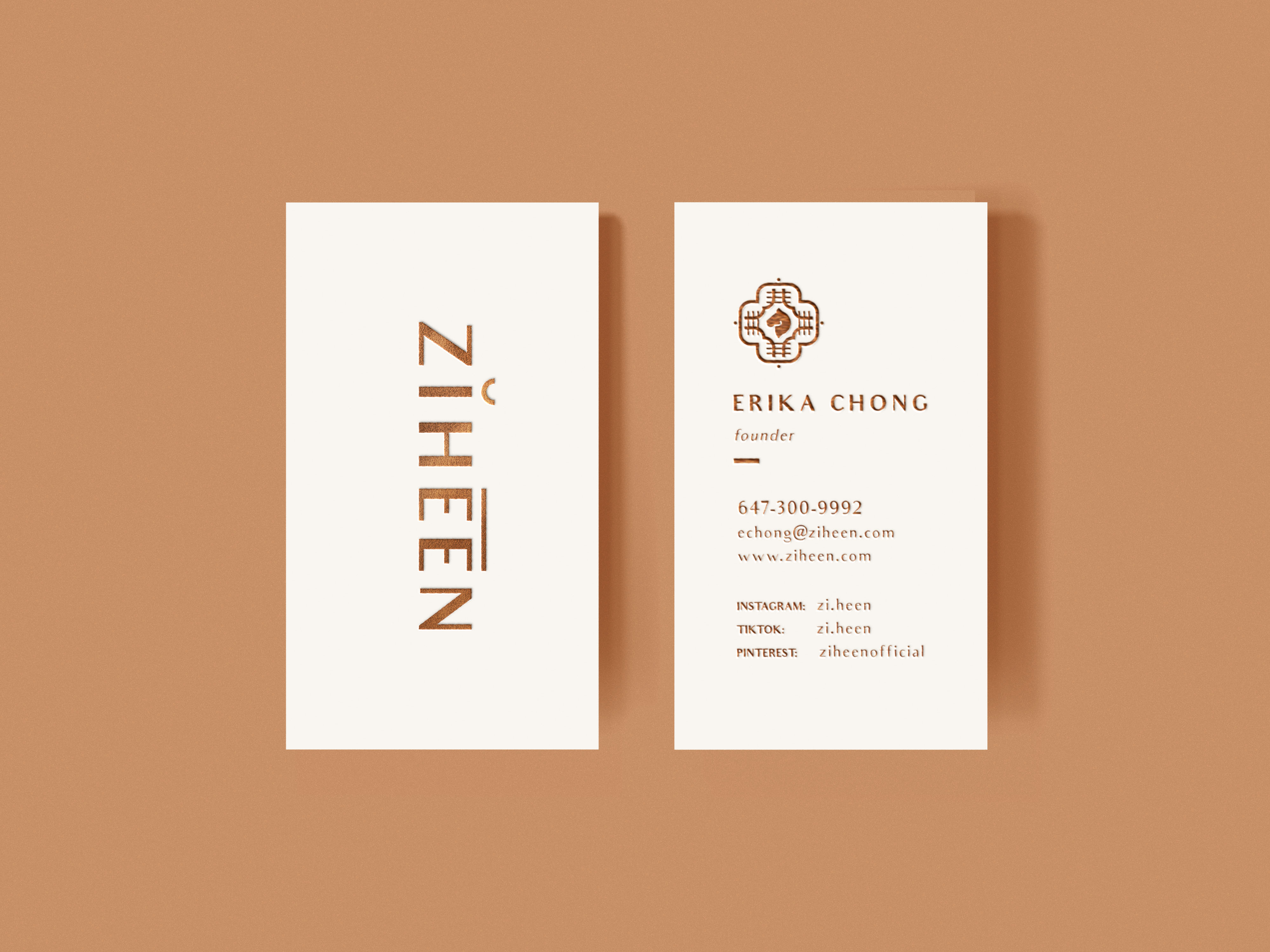
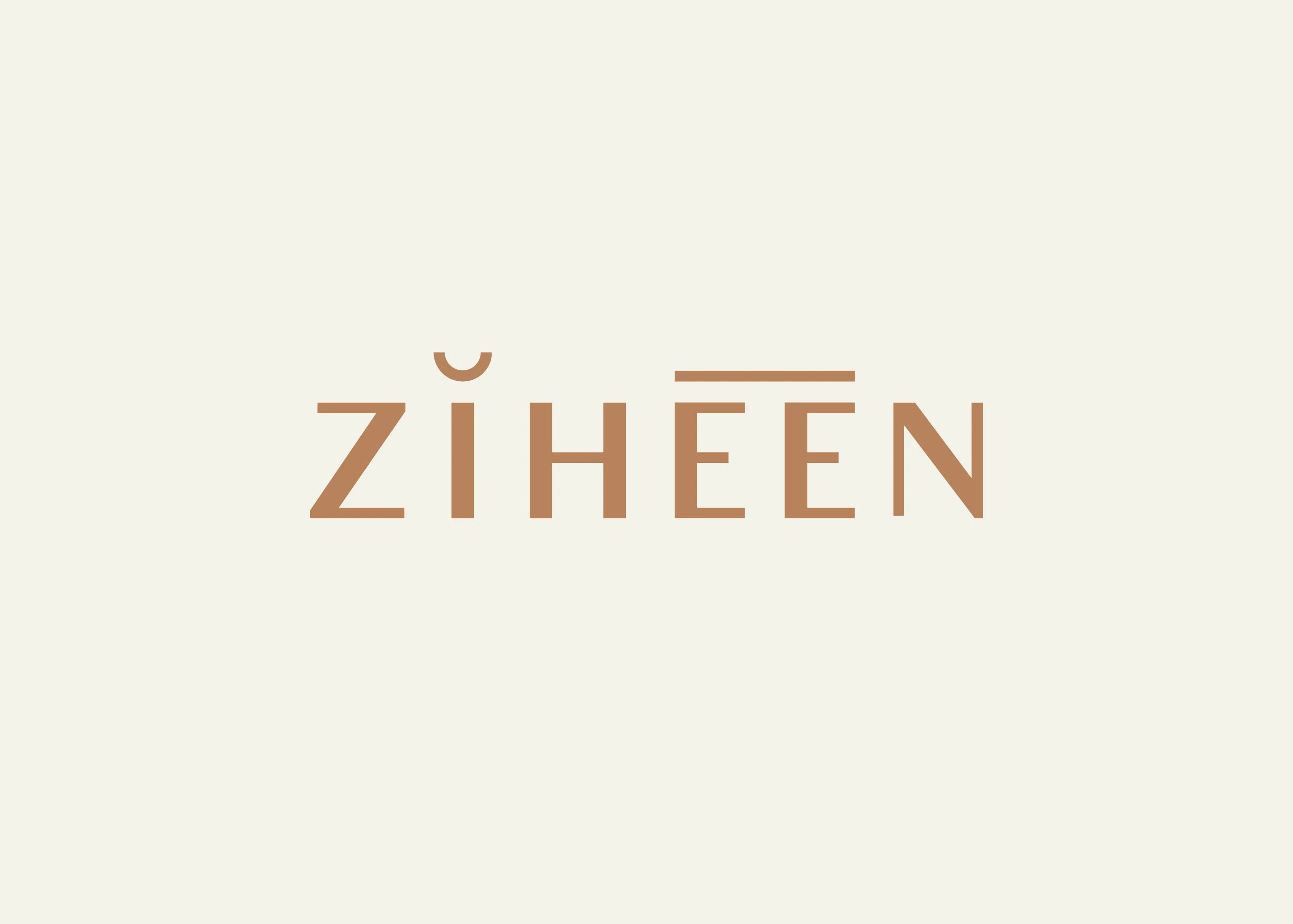
The final wordmark is stylized with phonetic symbols for "ZiHeen." While the name is foreign to western audiences, the phonetic symbols bridge the gap by making pronunciation more accessible and friendly. The logo displays a harmonious relationship between east and west.
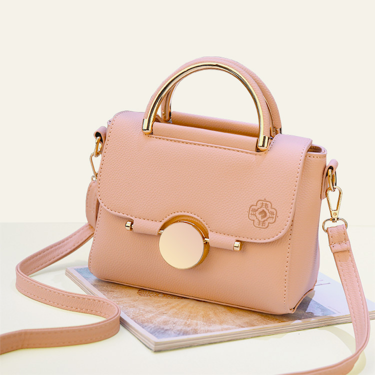
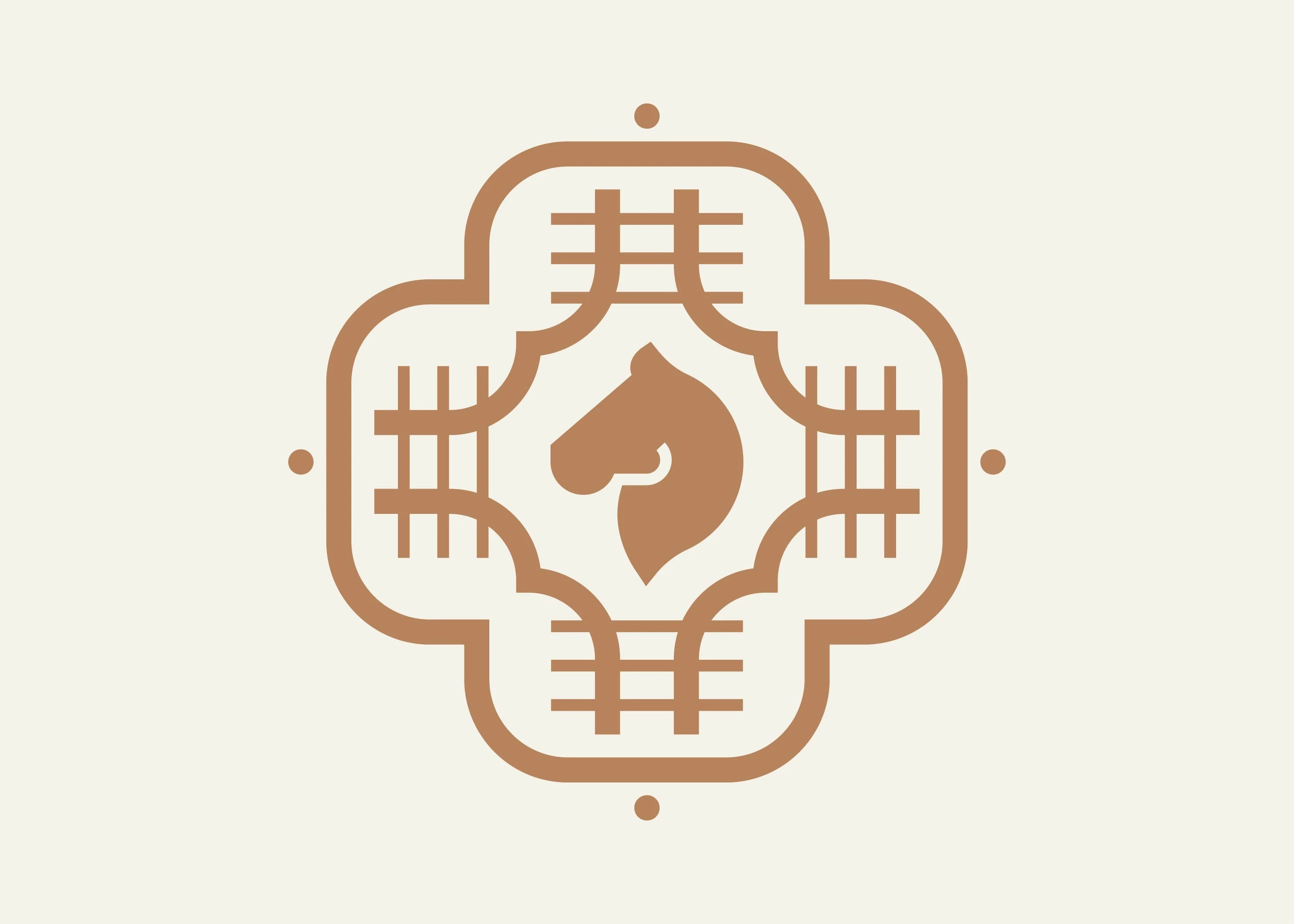
The logomark is inspired by the Heen character 騫. It resembles a traditional Chinese stamp while bringing meaning through the horse silhouette.
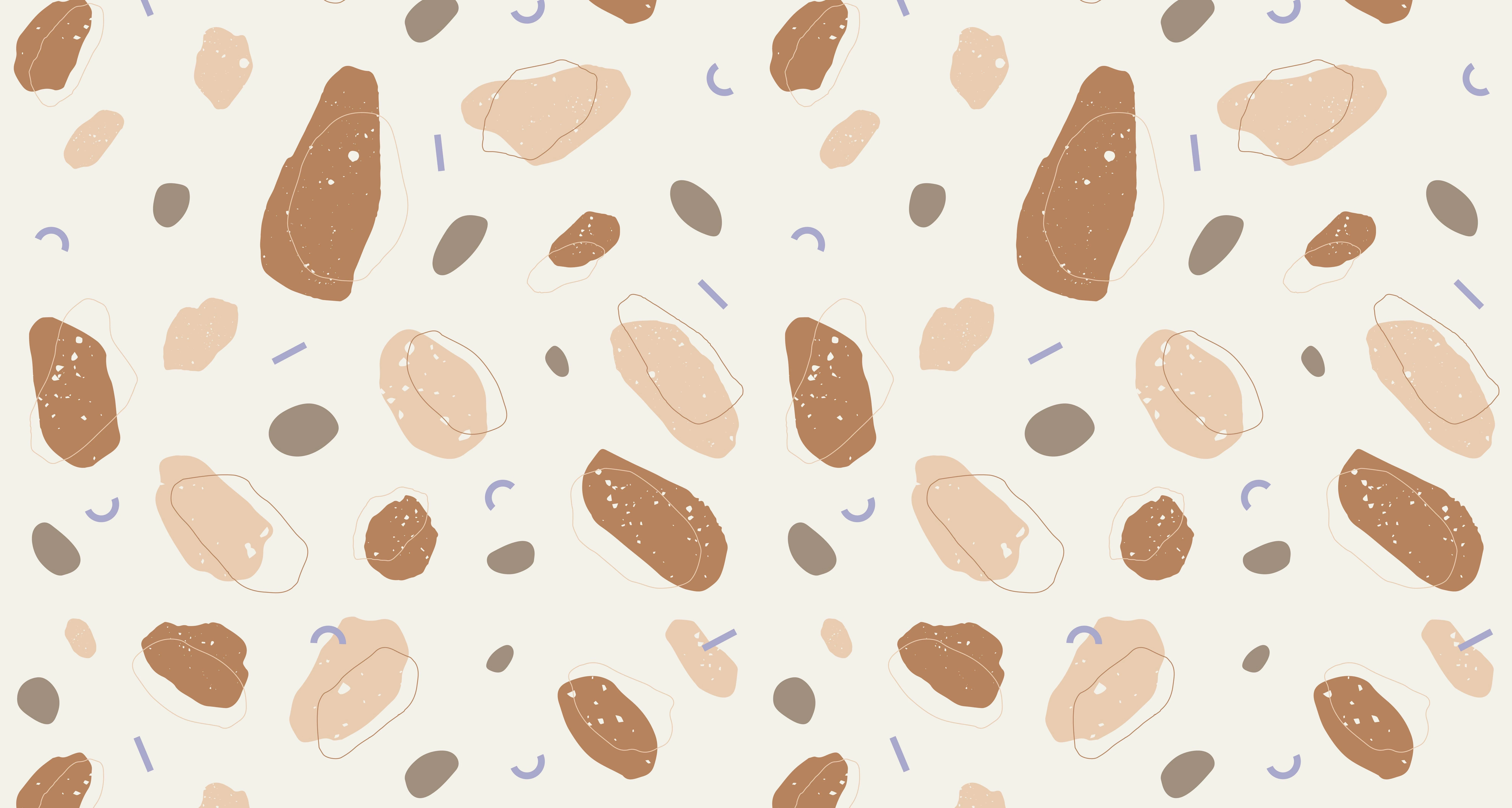
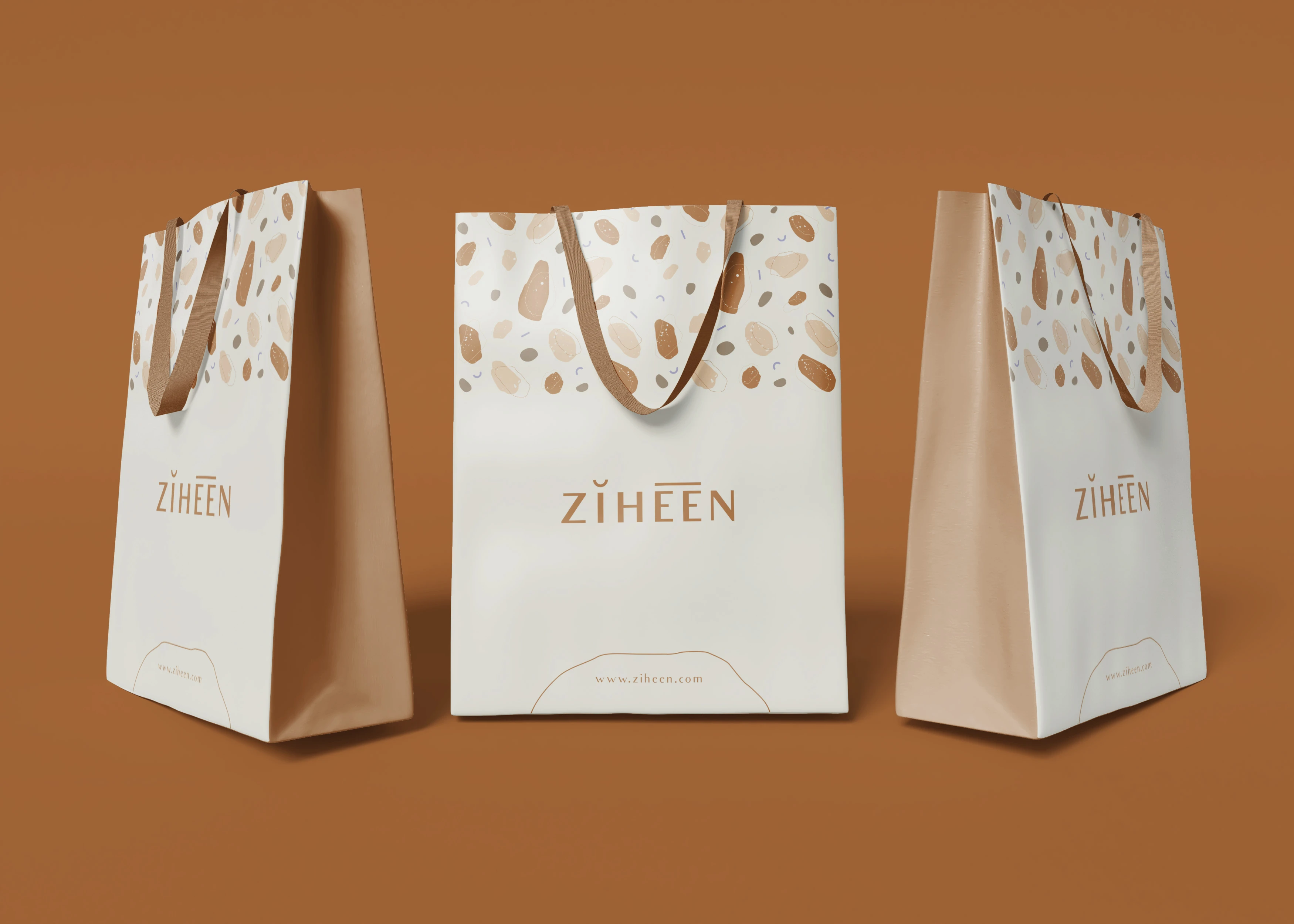
The chosen visual direction draws inspiration from organic imprints of natural elements, which ties together Chinese philosophy and western aesthetics.
The colour palette consists of warm earthy orangey-brown tones which create a sophisticated look. The lilac accents in the pattern add a touch of playfulness.

